Last month, we shared six dashboards to improve clinical outcomes. This month, as we focus on operational efficiency, we delve into how operational dashboards can transform your EMS data into useful information to measure and improve operations. Not sure how many staff to schedule on Sunday at 4 p.m.? Use historical data to help with crew scheduling. Experiencing delays between trips? Identify deficiencies in response times so you can improve those response times.
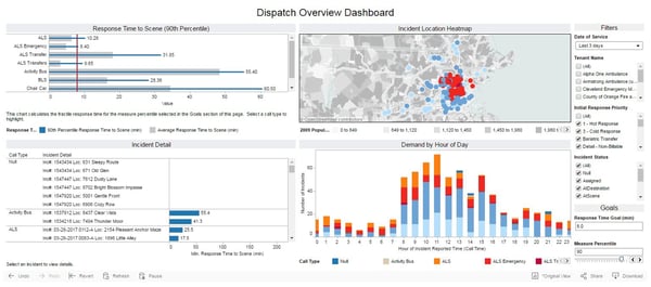
Dispatch Overview Dashboard
This dashboard provides a snapshot of the dispatch activity for your agency. Want to know how you did yesterday, last week or over the holiday weekend? Check here to find everything at a glance. Monitor response time performance, identify hourly demand or check the heatmap to see where your crews were dispatched. Want more detail? Drill down into specifics by filtering on Response Priority, Transport Status or Call Type to help keep a finger on the pulse of your agency.
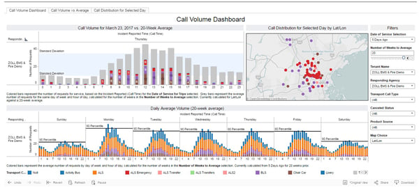
Call Volume Dashboard
This dashboard is great for analyzing current trends in your call volume to help make decisions on staffing or crew distribution. Compare your current call volumes—by call type—against the 20-week average for your agency. It's easy to see if volumes are up or down significantly, either across the board or during specific hours of the day. That's actionable info you can use to start adjusting your staffing plan. If the map shows you're seeing a spike in BLS calls to a distant corner of your service area, it might be time to shift an extra BLS truck closer to those calls.
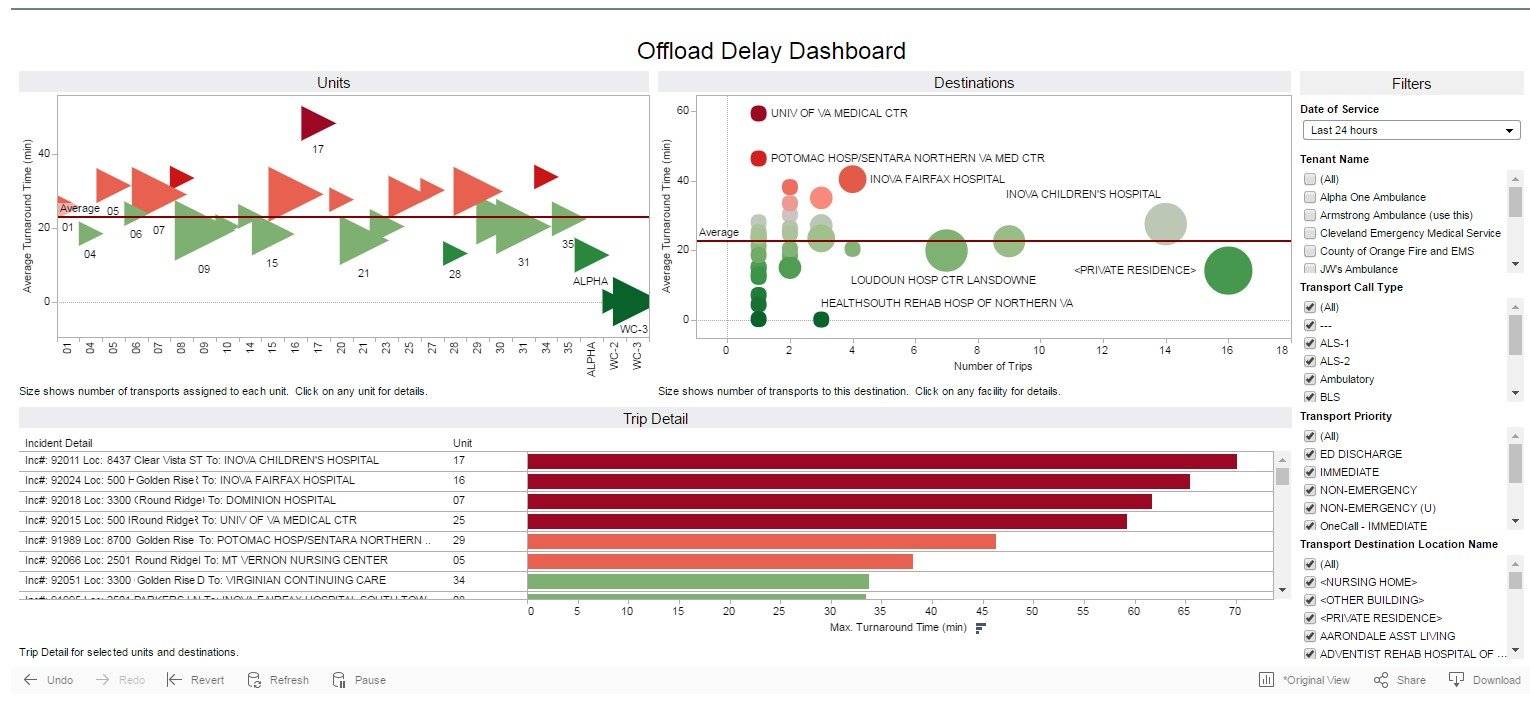
Offload Delay Dashboard
Offload delays can have a huge impact on your agency's performance and staffing. This dashboard is a one-stop-shop for the information you need to start minimizing these costly delays. Is the problem with your crews, with the facilities or both? One glance at the unit graph shows delay times across all runs for all units. Select a unit to drill down into their runs; if delay times were high across all facilities, it's time to talk to the crew. Alternatively, you can easily see in the destination graph whether a specific facility has higher delay times that warrant further investigation.
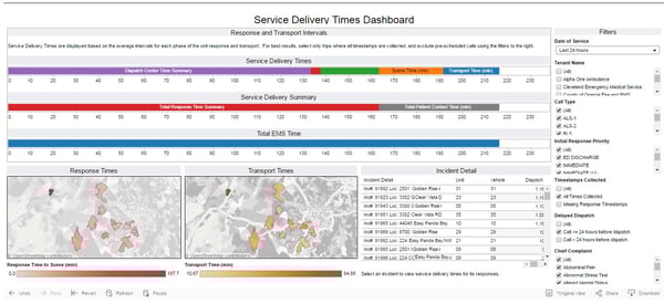
Service Delivery Time Dashboard
This dashboard is your go-to when you want to understand your agency's overall service time performance. Look at performance for either short periods of time (last week), or at performance averages over time (last year). Each phase of the transport is broken out by color, making it easy to compare average Wheels Rolling to Response Time to Scene. The map displays make it easy to see if you're experiencing Response or Transport time challenges in specific regions of your service area. For additional detail, filter to view performance by Call Type or Response Priority.
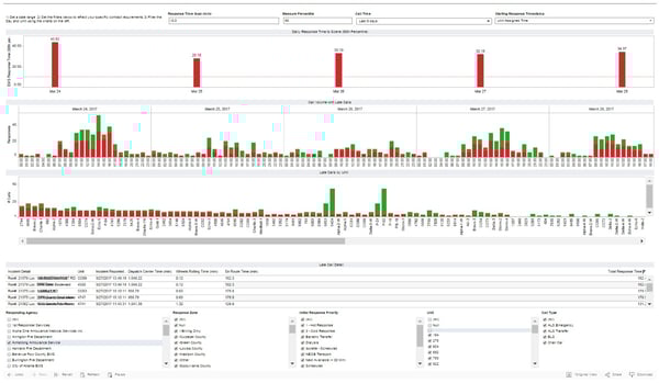
Emergency Response Time Compliance Dashboard
Monitor your contractual compliance for emergent calls based on the percentile response time (default is 90th percentile) for any given day or range of days. Configure your contracted response time and performance percentile to see how your agency is performing against contract; clear color coding shows instantly if you've got a problem. Check the performance of individual units to see if there's a problem across the board or if overall performance is being impacted by a single crew.
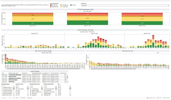
Routine On-Time Performance Dashboard
If you're looking to optimize your scheduled transport performance—and maybe win some new business—this is the place to start. This dashboard shows the percentage of calls where crews arrive to a prescheduled or routine transport prior to the scheduled pickup time. You'll not only know if your units are showing up late, but can also see exactly how late. Performance is tracked across each hour of the day, so you'll know if you need to allocate more units during heavy hours. Get your on-time performance in the green and demonstrate to your customers the value of the service you provide.
Interested in Insight Analytics?
Insight Analytics provides ZOLL customers with the tools to quickly and easily measure performance through real-time visibility to your data and greater insight into key performance indicators (KPIs). Now fire and EMS organizations can use this multidirectional data analysis tool to evaluate the data collected from ZOLL software, for critical decision-making and planning decisions. The easy-to-use dashboards provide information at a glance, giving immediate insight into protocol, compliance, productivity and more. Manage operations through a level view to quickly identify trends and data outliers or drill down for root causes.